Route Maps Without a Map Vendor
A dev log from wattlog.pro — a cycling training platform I build alone. This is the story of adding route maps: why the obvious solutions did not work, how a $0/month setup replaced a paid map service, and how a competitor's screenshot led me to a 40-year-old algorithm.
The setup
wattlog.pro is a training platform I build and run alone. The stack:
- FastAPI backend, React frontend
- live BLE data from smart trainers and power meters
- a CTL/ATL/TSB training-load model
- structured workouts that control the trainer in ERG mode
Users import GPX routes and ride them indoors with simulated gradients.
For months, a "route" in the app was just a name, a distance, and an elevation chart. No map. If you imported a ride through the Tatra mountains, you saw a line chart. The real shape of the route existed only in your memory.
The fix sounds easy: draw the GPX line on a map. Every tutorial shows this in ten lines of Leaflet. The interesting part is everything the tutorials skip.
Constraint one: the app is not (only) a website
wattlog ships three ways from one React codebase:
- a web app
- a desktop app (Python + pywebview wrapping a WebView)
- mobile apps (Capacitor, iOS and Android)
This creates two hard limits.
No WebGL. WebGL in the desktop WebView is too unreliable, so we treat it as unavailable. That rules out MapLibre GL — the standard choice for vector maps in 2026. Whatever renders the tiles must use a plain 2D canvas.
Nothing loaded at runtime. The mobile shells cannot fetch config or scripts over HTTP at startup. Everything must be a normal npm dependency. No CDN scripts.
Conclusion: Leaflet (canvas-friendly, boring, reliable) plus some tile source.
Constraint two: tiles without a subscription
The obvious answer is a hosted tile service. But read the terms:
- MapTiler free tier: non-commercial use only, logo required, 5,000 map sessions per month. wattlog is a real product, so this breaks the terms on day one.
- Raw OpenStreetMap tile servers: production app traffic is not allowed.
Every "free" option had a hook in it.
The alternative: Protomaps. They publish the whole planet, every day, as one PMTiles file. Any tile inside it can be fetched with an HTTP Range request. No tile server. No API key. You put one file on any static host, and the client reads byte ranges from it.
The full planet is ~136 GB, but pmtiles extract can cut out a region
directly from the remote file — you never download the planet. My users are
in Poland, so:
pmtiles extract <daily-build-url> route-map.pmtiles --bbox=<poland>
Eight minutes later: a 3.8 GB file covering the whole country at zoom 0–15.
One practical problem: the production EC2 server had only 5 GB of free disk. So the file went to a private S3 bucket behind CloudFront (built with Terraform). Traffic fits inside CloudFront's free tier. Total cost of the map stack: ~$0/month.
Two production details worth writing down:
- Hotlink protection is a CloudFront Function that checks the
Origin/Refererheaders. It must allow requests with no such headers, because the mobile and desktop shells do not always send them. The allowlist is explicit:capacitor://localhost(iOS),https://localhost(Android),http://localhost:8000(desktop), plus the web origins. - The CloudFront cache must be keyed by
Origin. Without this, a Range response with CORS headers for one origin was cached and served to a different origin — which broke mobile. One cache-policy change fixed a bug that looked, from the client side, like tiles failing at random.
How would this scale? Europe, the US, the whole planet
A fair question: the Poland extract works because my users are in one country. What if wattlog grew and needed maps for Europe, the US, Asia — or everywhere?
The nice property of this architecture: cost scales with stored data, not with users. The client fetches byte ranges from a static file. More regions mean a bigger file on S3; more users mostly stay inside CloudFront's free tier for a long time.
Rough numbers (S3 standard storage, ~$0.023/GB/month):
| Coverage | PMTiles size (zoom 0–15) | S3 storage cost |
|---|---|---|
| Poland (current) | 3.8 GB | ~$0.09/month |
| Europe | ~35 GB | ~$0.80/month |
| Europe + North America | ~65 GB | ~$1.50/month |
| Full planet | ~136 GB | ~$3.10/month |
So the "worst case" — serving maps for the entire planet — costs about as
much as one coffee per month. And it is simpler than the current setup:
no pmtiles extract step at all, just copy the daily planet build.
Traffic is the second axis. CloudFront's always-free tier includes 1 TB of transfer and 10 million requests per month. A single map view loads roughly 15–30 vector tiles, a few hundred KB in total. That means hundreds of thousands of map views per month before the first cent of transfer cost. Past the free tier, CloudFront charges ~$0.085/GB — at that point the product has a traffic level where $10–20/month is not a problem.
Compare with the hosted alternative. Session-based pricing (MapTiler and similar) scales linearly with users: tens of dollars per month at small scale, hundreds when the user base grows — forever, regardless of how little the map data changes.
The honest costs that do grow with coverage:
- Data freshness. A bigger file means a longer re-extract or re-upload when you want newer OpenStreetMap data. Poland refreshes in minutes; the planet is a ~136 GB upload. Still a cron job, not an architecture change.
- Cold starts. First tile loads in a rarely-viewed region are served from S3 instead of the CloudFront cache. With one CDN distribution this is milliseconds of difference, not a redesign.
Conclusion: the design was not a small-scale trick. It scales from one country to the planet by changing one bounding box and about $3/month.
A correction during implementation
The plan said: render with leafletRasterLayer from pmtiles.js. That
turned out to be wrong. That function is for raster PMTiles files, and
Protomaps builds are vector tiles.
The correct tool is leafletLayer() from protomaps-leaflet. It decodes
vector tiles and paints them on a canvas — no WebGL, which is exactly what
we needed. It also ships light and dark map themes, so the CSS
filter: invert() hack planned for dark mode was replaced with a real dark
style.
I note this because the correction is the valuable part. The plan was written from documentation. The fix came from reading the library source after the first render produced garbage. Plans describe intent, not truth.
"Why does the competitor's map look better?"
Shipped. Then I put wattlog's map next to veloplanner.com. Same OpenStreetMap data — but their map showed buildings, railways, terrain detail. Ours looked like a wireframe. Same data, worse map. Why?
Hypothesis 1: our Poland extract is missing layers. Wrong. The extract is a straight cut of the full planet file. Everything is there.
Hypothesis 2: the default style skips buildings and rail. Also wrong — and here reading the source paid off again. In the built-in themes, buildings are drawn: as a fill at 0.5 opacity, no outline. Rail is drawn: as a thin dashed line at 0.5 opacity. On a small embedded map, "half transparent" and "absent" look the same.
It was never a data problem. It was a contrast problem.
The fix uses how the renderer works: paint rules apply in order, one on top of another. So instead of forking the whole theme, I take the built-in rules and append two more — a stronger building fill with an outline, and a solid rail line.
One API trap cost an hour: if you pass flavor to leafletLayer(), your
custom paintRules are silently ignored. The two options exclude each
other — and you only learn this from an if/else in the source.
The interaction layer got the same review. Wheel-zoom was disabled on purpose (a map that zooms on scroll hijacks the page scroll), but nothing replaced it. Now the map follows the Google Maps embed convention: plain scroll moves the page and shows a short "Ctrl + scroll to zoom" hint; Ctrl/Cmd+scroll zooms the map.
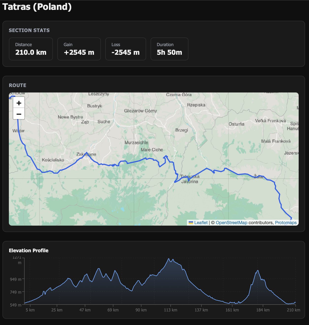
The corner-cutting bug
One more complaint from testing: on twisty mountain roads, the drawn route cut corners. On hairpins, the line went straight through buildings.
The cause was in the backend. The endpoint that serves route geometry reduced the number of points in the most naive way possible: keep every Nth point, maximum 600. This method is blind to shape. It drops the tip of a hairpin as easily as a point on a straight road. Keep one point before the turn and one after it, and the line renders as a straight cut across the bend.
The right tool is forty years old: Ramer–Douglas–Peucker. RDP keeps the points that carry shape — it always keeps the point of maximum deviation, which on a hairpin is the apex — and removes everything that lies on a straight line. With a tolerance of ~5.5 meters (below GPS noise, so the line never visibly moves), a 5,000-point straight road collapses to a handful of points, while every switchback survives.
I wrote the failing tests first:
- a synthetic hairpin whose apex must survive simplification
- a 5,000-point straight line that must collapse to fewer than 50 points
The old sampler failed the second test immediately (it kept ~626 redundant points). The RDP implementation is ~40 lines of plain Python, iterative (stack-based, so no recursion-depth risk), no new dependency.
One distinction users often mix up: RDP fixes corner cutting — our sampling artifact. It does not fix the route drifting a few meters off the street. That drift is GPS receiver noise in the recorded data, and Strava and Garmin show it too. Really fixing it needs map-matching against the street network (OSRM/Valhalla). That is filed as a low-priority TODO with the trade-off written down: map-matching wrongly "snaps" the gravel sections that cyclists ride on purpose.
What the audit trail caught
Adding the map to a second page (the pre-ride setup screen) made me trace what the route-detail endpoint really does per request. The answer: it re-parses the raw GPX from the database and re-runs the full elevation pipeline — two smoothing passes over every trackpoint — on every GET.
Nothing is cached. The computed geometry was never saved. It works, it is just wasteful — and every new page that shows a route multiplies the waste. That is now a scoped TODO (save the computed segments as JSON at import time), not a surprise someone finds during an incident.
What this project demonstrates
Written for the reader who wants to know if I can do this for their team:
- Constraint-driven architecture. No WebGL and no runtime loading eliminated the default stack. The chosen one (Leaflet + protomaps-leaflet
- PMTiles) satisfies every constraint instead of fighting them.
- Vendor evaluation with the terms actually read. The "free" tier that was not free; the self-hosted alternative that truly is ($0/month, no keys, no quotas), with the ops cost honestly paid in Terraform.
- Infrastructure as code. S3 + CloudFront + a CloudFront Function, with a cache-key bug found and fixed. Small, but production-real.
- Debugging by reading source, not docs. Both course corrections — the raster/vector mix-up and the "invisible buildings" discovery — came from the renderer's source code.
- Knowing the classic algorithm. Recognizing a sampling artifact and reaching for Douglas-Peucker, test-first, with tests that encode the real failure (a hairpin apex), not implementation details.
- Honest triage. GPS noise and sampling artifact separated; the cheap one fixed, the expensive one filed with its trade-offs. Not everything found gets built.
The map is live on the route detail and ride setup pages. Total recurring cost: zero. Total external dependencies at runtime: one static file on a CDN.